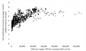
 To visualize the connection, I put GDP per person per year on the horizontal x-axis, which goes from 0 to 130,000 dollars, and life satisfaction on the vertical y-axis, which goes from 0 to 9. Most of the data is between 0 and 40,000 dollars and between 3 and 7, with some more data over on the right where the really rich people live.
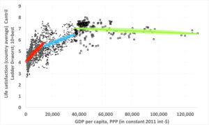 As people move from absolute poverty to the world average, an increase in GDP per person really does lead to people being more satisfied with their lives. But already moving from the world average to the rich world average the fitted line becomes flatter. In fact, if you check the slopes of the two lines, the blue one is two and a half times flatter than the red one. That means that in the middle, GDP per person per year has to rise more than twice as much as on the left to give the same increase in life satisfaction. Perhaps you realize now why working ever harder to become more satisfied rings so hollow.